Tuesday, May 3, 2011
Final Project
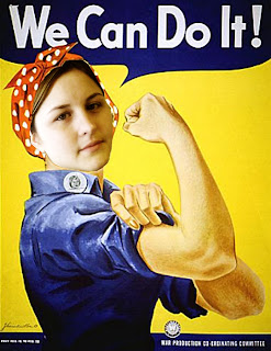
I chose to paint on each of these three pictures. I really didn't know what to do so I just played around and I think my first picture was the best out of all three of them. I like to use the painting tool because it was way easy after I figured it out!!!
Thursday, April 21, 2011
Project 5: CD Case
Front Cover and Inside Cover
Inside Cover behind CD
Back Cover
I chose to do a hunter country mix because my family and I do a lot of hunting during the seasons and I am a big country fan. I thought it would be a good idea because I really haven't seen a cd like this in stores. Overall I just thought it would be fun because I also like the colors on the ducks and I love seeing deer in the middle of the fields enjoying their peace and quite.
Thursday, March 31, 2011
Project 4: Digital Painting-Original Painting
These picture I used the mixer brush tool, I keep the original picture as my background, than I copied it to make a new layer and used the mixer brush tool again but keep it clean after each brush stroke to get the back ground to mix the colors in the couch. After I did that on that layer I made a new layer and started to paint on the dogs and pillows and for that I used the eyedropper tool to get the exact colors that I need to paint. These image is the final version!!!
Project 4: Digital Painting-Master Study Portrait

 Original
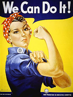
 This project was the Master Study Portrait. I used the this poster because I really like it and I believe women and men should be treated equal! To do this I cut my face out of an original picture than placed it on top of the poster and changed a couple of layers by using some of these adjustments color balance, levels, a couple hue and saturation, and a balance and color. After I did those I put copied the poster and cute out her face in the poster and then placed that on top of all they layers.
Thursday, March 3, 2011
Tuesday, March 1, 2011
Project 3: Surrealistic Photomontage
My theme for this project was to deal with the waste of paper that people use everyday and some people don't think about recycling.
Wednesday, February 16, 2011
Project 3 Artists
Digital Surrealist: Archan Nair "Gaia" really caught my eye because I like how he used all the objects together to make the girl look like she is taking a bath. But yet he has a road going around her and the tin tube is leaking making a lake for the city. I like the use of the bright colors popping out of the top it gives it attitude. I think he is different from Dali because he makes everything look real. Dali and Nair could have the same affect because they both used landscape in their backgrounds.
Traditional Surrealist: Salvador Dali "The Persistence of Memory", Dali was devoted to a passionate intensity and described his method as 'paranoiac-critical".With this method he demonstrate his personal obsession and fantasies by uncovering hidden forms within preexisting ones. This piece of art catches my eye all the time because I like how he uses the clocks and to me it makes me feel that you better do something in life or your time my run out. I think he did a real good job on making the objects look like they are melting away. This piece makes me realize how much time one person can waste away if they just sit around and do nothing in life.
Traditional Surrealist: Salvador Dali "The Persistence of Memory", Dali was devoted to a passionate intensity and described his method as 'paranoiac-critical".With this method he demonstrate his personal obsession and fantasies by uncovering hidden forms within preexisting ones. This piece of art catches my eye all the time because I like how he uses the clocks and to me it makes me feel that you better do something in life or your time my run out. I think he did a real good job on making the objects look like they are melting away. This piece makes me realize how much time one person can waste away if they just sit around and do nothing in life.
Thursday, February 10, 2011
Project 2
This photo is about where I spend most of my time during my art courses, which would be mostly in the Spafford Hallway or the Mac Lab doing homework and talking to friends.
Thursday, January 27, 2011
Project 1: Elements and Prinicples of Art
Contrast: I made the rat stand out more than the rest of the background. F 3.2 1/60
Unity: I keep the original photo and didn't make any changes. I like how the colors turned out with the lighting inside the building that I was in. F 3.5 1/50
Space: I made it black and white. I like the way it makes you feel like your driving down the road. F 4.0 1/1000
Texture: I made it black and white, played with the other colors to dim the black out some. I like this photo because it just makes me feel like I can touch it. F 4.8 1/250
Shape: I straightened the right side because it had a piece of my bedroom door and I didn't want it in there. I also played with the contrast of the black and white. F 2.8 1/60
Thursday, January 13, 2011
My LIfe
My name Amanda Ronke
Childhood ambition I wanted to become a Vet
Fondest Memory Meeting my boyfriend Paul
Proudest moment Graduating High School
Biggest challenge Completing College
Alarm clock Cell phone set at 8 am
Perfect Day Sun Shinning
Indulgence Diet Dr. Pepper, Chocolate
Favorite movie Dirty Dancing
Soundtrack Alvin and the Chipmunks:)
Inspirations My Family
My life is intense
Subscribe to:
Comments (Atom)


